Re Branding, Catalogue
SCOPE
CLIENT
AOne apps
D MONK HOMES


For DMonk Homes, we undertook a complete rebranding of their visual identity—starting with a refined logo redesign. The new logo was crafted using clean, geometric forms to enhance recognizability while maintaining a minimal, premium look. Our focus was on creating a mark that feels modern yet timeless, with strong global appeal. Alongside this, we designed a top-quality catalogue that reflects the brand’s design philosophy—elegant, detail-driven, and aligned with DMonk’s commitment to excellence in interior solutions.
DMonk Homes is a Bangalore-based interior design company with roots in timber and hardware craftsmanship. Founded in 2017, it offers end-to-end interior solutions for modern homes and commercial spaces. Known for its tech-driven, space-optimized designs, the firm provides custom furniture, decor, and turnkey interiors. With in-house manufacturing and timely execution, DMonk blends elegance with functionality across every project.
INTRODCUTION
DESIGN APPROACH

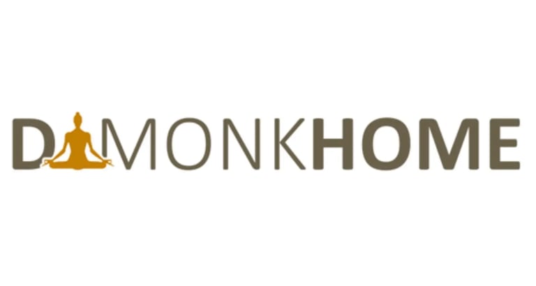


Previous logo
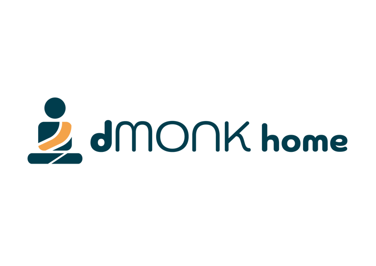
New logo
the identity was redesigned to give dmonk home a more modern, premium and distinctive presence while retaining its original essence. the new symbol, custom typography and deep teal–orange palette create a balance of calm, warmth and contemporary Indian character, making the identity versatile across interiors, digital and print applications.


HEX #003c4c
HEX #f4a34a
HEX #fbf8ee
Deep Teal
Saffron / Warm Orange
Off-White / Cream
The colour palette combines deep teal, saffron orange, warm cream and natural wood tones to create a balance of calm, warmth and sophistication. deep teal brings depth and trust, while saffron adds creativity and an indian warmth. the cream tone keeps the identity minimal and spacious, with wood and earthy textures connecting the brand naturally to interiors, materials and contemporary indian living.


Brand Typeface


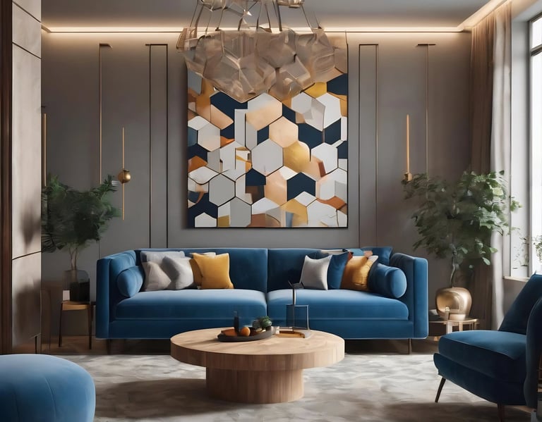
Creating elegant interiors for every home
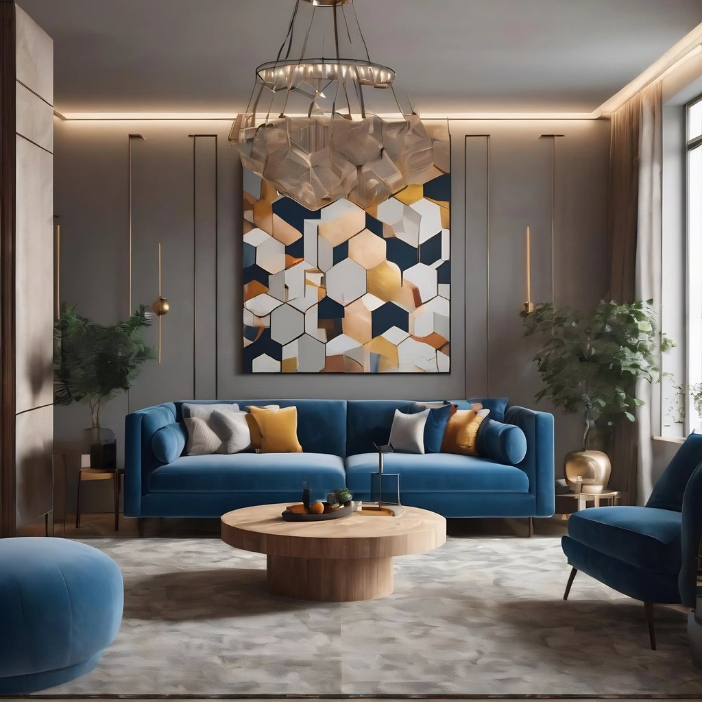
the catalogue was designed as a premium brand communication piece, combining clean editorial layouts, strong typography, warm imagery and the dmonk home colour palette. the use of deep teal, saffron and cream creates visual consistency, while spacious layouts and lifestyle photography make the catalogue feel sophisticated, approachable and rooted in contemporary interior design.


PDS PARAKH

NEXT
Working on something like this ?
Tell us about your brand, business, or idea. We'll get back to you within 24 hours.


PREVIOUS PROJECT
NEXT PROJECT
BIGCAT CREATIVE STUDIO
© BIGCAT CREATIVE STUDIO
BACK TO HOME
