HOYNA
Naming, Brand Identity, Packaging
Client
HOYNA
SCOPE


Premium dry fruits brand built around the idea of purity, quality, and understated elegance. The brand brings a refined approach to everyday dry fruits, combining carefully selected products with sophisticated packaging that feels modern, clean, and trustworthy.
Centred around creating a premium yet approachable visual identity. The direction combines minimalism with subtle organic elements to reflect the natural origin of dry fruits while maintaining a sophisticated, contemporary feel. The logo uses custom, expressive letterforms to create a distinctive brand signature, while the packaging follows a clean and spacious layout that allows the product to remain the hero. A warm, neutral colour palette, refined typography, soft curves, and carefully placed graphic elements create a sense of purity, quality, and modern luxury.
INTRODCUTION
OUR APPROACH


Vision
to make premium dry fruits a part of everyday living — sourced with care, presented with elegance, and delivered with uncompromising quality.
we envision building a trusted modern dry-fruit brand that brings together purity, premium sourcing, freshness, and thoughtful design, making every pack feel as good as the product inside.
from nature to your table — premium, honest, and beautifully delivered.


Mission
to build a distinctive premium identity for HOYNA through a bold, memorable logo, refined typography, minimal aesthetics, and sophisticated packaging — creating a visual language that feels modern, elegant, natural, and instantly recognisable.
the branding is designed to elevate dry fruits from a commodity into a premium lifestyle product, where every visual detail communicates quality and care.
the overall feel is warm, refined, contemporary, and trustworthy — balancing the richness of premium dry fruits with a clean, modern design language.
from the logo and colour palette to the packaging and photography, every touchpoint is crafted to make HOYNA feel premium, desirable, and beautifully considered.
Colour Pallet
the colour palette is built around warm, earthy neutrals that communicate natural goodness while giving the brand a sophisticated, premium feel.
the soft cream base creates a clean and elegant canvas, while warm beige and muted earthy tones add depth and a connection to the natural origins of dry fruits. The dark charcoal typography provides strong contrast and gives the identity a confident, contemporary character.
the overall colour approach is intentionally minimal and restrained — avoiding excessive colours and letting the product, photography, and packaging details stand out.
warm • natural • refined • minimal • premium
Warm Ivory / Soft Cream
HEX: #F9F0E1
RGB: 249, 240, 225
Warm Sand / Soft Taupe
HEX: #CCB798
RGB: 204, 183, 152
Deep Charcoal / Graphite
HEX: #363437
RGB: 54, 52, 55


Typography
Comba
The typography is bold, clean, and contemporary, creating a strong premium presence. The custom letterforms feature geometric proportions and subtle organic curves, giving the wordmark a distinctive character while maintaining excellent readability.
The rounded and fluid details complement the natural essence of the brand, while the strong weight communicates confidence, quality, and reliability. The custom treatment of individual letters also makes the logo more memorable and gives it a unique visual identity rather than relying on a conventional typeface.


NEXT

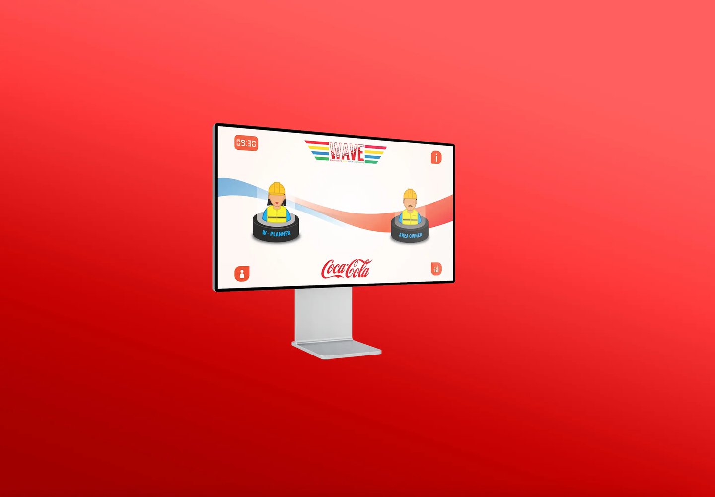

WAVE COCACOLA
Working on something like this ?
Tell us about your brand, business, or idea. We'll get back to you within 24 hours.

BIGCAT CREATIVE STUDIO
© BIGCAT CREATIVE STUDIO
BACK TO HOME