SIGNAVOX
Logo Design, Website Ui Consulting
CLIENT
Signavox
SCOPE


Signavox is a Hyderabad-based company specializing in providing backend support solutions to IT companies. The brand plays a crucial role in helping tech firms streamline their operations, ensuring efficiency, scalability, and sustainable growth. As a support engine behind thriving IT systems, Signavox needed a visual identity that reflects its silent strength, technical precision, and forward-moving drive.
INTRODUCTION
DESIGN APPROACH
In the Signavox logo, we seamlessly integrated the icon into the text itself. The letter ‘A’ was chosen as the central element, becoming the core of the logo identity. The dot represents companies and connections, forming the base of the design.
The curved stroke transforms into an upward arrow, symbolising progress and growth. Together, the design reflects innovation, vision, and a future-focused brand


the logo combines two simple ideas into one visual language. the central form represents the companies and businesses, while the upward arrow signifies growth, progress, and forward movement. together, the symbol communicates a clear brand promise — signavox helps businesses move forward, grow, and reach their next level.


the identity is intentionally minimal, geometric and scalable. the symbol has been constructed using simple proportions and relationships, allowing it to remain recognisable even when reduced to a small digital icon. the same geometry can also be expanded into larger visual elements, creating consistency across the brand system.



the logo combines two simple ideas into one visual language. the central form represents the companies and businesses, while the upward arrow signifies growth, progress, and forward movement. together, the symbol communicates a clear brand promise — signavox helps businesses move forward, grow, and reach their next level.


the wordmark uses a bold, geometric sans-serif approach to create a contemporary and confident personality. the clean letterforms complement the constructed nature of the symbol, while the strong weight gives the brand presence across digital and physical applications.


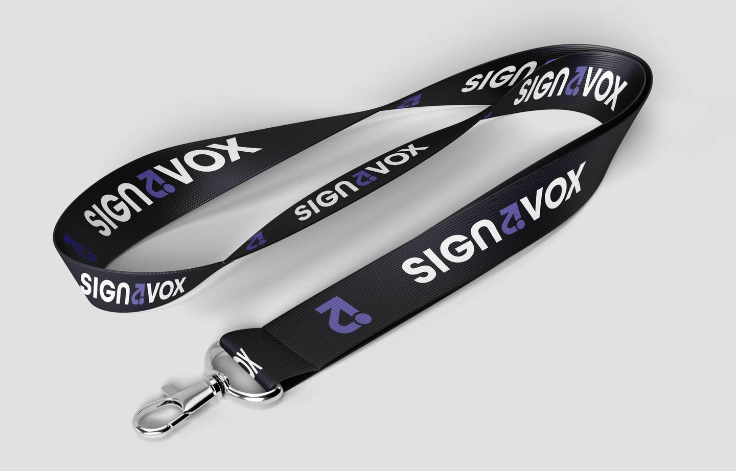


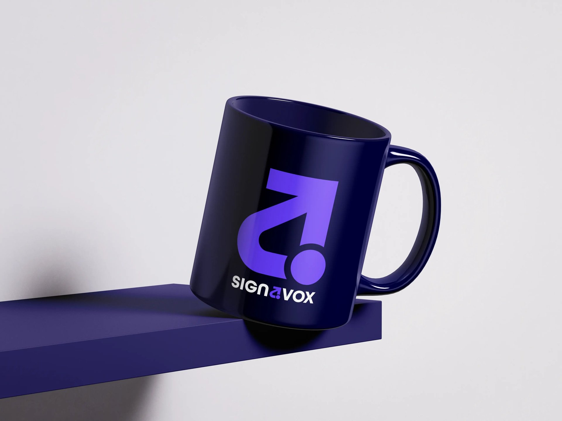

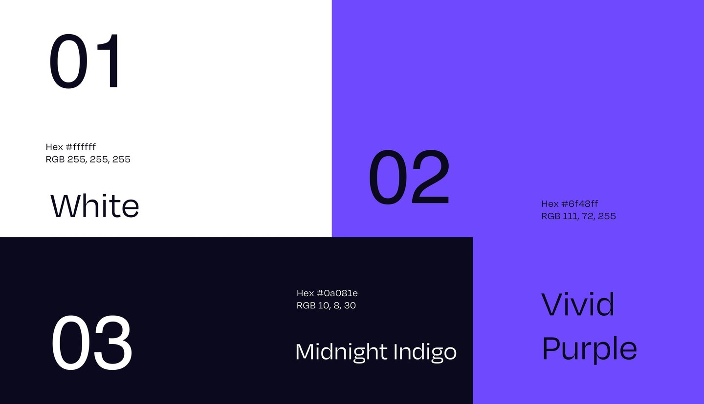
The Signavox UI design was crafted with a clean, futuristic approach that reflects the brand’s innovative and tech-driven identity. The interface uses a deep gradient palette of purples and dark tones to evoke sophistication and trust, while the bold typography ensures strong visual hierarchy and readability. The recurring arrow motif—drawn from the logo—subtly appears across sections, symbolizing progress and forward momentum. Carefully balanced illustrations, 3D elements, and geometric graphics add energy and depth, creating an engaging digital experience that feels both professional and dynamic. The overall design seamlessly merges aesthetics with functionality, giving Signavox a modern, confident, and visionary presence.
the result is more than just a logo — it becomes a visual representation of the brand’s purpose. the arrow communicates where the brand wants its clients to go, while the circular form represents the businesses it helps along that journey.
in essence: businesses at the centre. growth in motion. signavox moving them forward.


RESQ GENIE
NEXT

Working on something like this ?
Tell us about your brand, business, or idea. We'll get back to you within 24 hours.

PREVIOUS PROJECT
NEXT PROJECT
BIGCAT CREATIVE STUDIO
© BIGCAT CREATIVE STUDIO
BACK TO HOME
